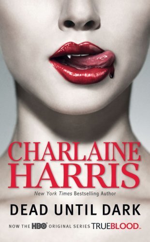
Dead Until Dark
The show, True Blood, did several wonders for Charlaine Harris's Sookie Stackhouse series. It made her popular and skyrocketed her sales for one, but it also started to create new covers for the series. Let's just say, they needed a new look, but more on that later.
First off, this is a very visually pleasing cover that is bound to catch your eye. The red against the white pops and draws you in, and the cropping of the photo brings your eyes toward those lips even more. Just by looking at this cover, you can tell that this is a vampire novel. The downfall is that the cover makes it seem that the book inside is bound to be fairly steamy when that isn't really the case. The other good news is although it is a sexy cover, it is still pretty tame so it probably won't be an embarrassment for most people to carry in public.Well, at least for the women.

Living Dead in Dallas
Ah. The original Sookie Stackhouse covers. What were they thinking? Okay, it isn't the worst thing out there, but personally, I'd be passing this one up. The style may work well for a youth book perhaps, but in the adult section, it just looks lack luster and silly. I guess kudos to the cover for actually having the character on it. That's always nice to see, but I think they would have been better off using something else. The art is not kind to the eyes. Also, it looks like Sookie is sitting on a rocket propelled coffin. Although the Sookie Stackhouse books aren't my favourite, these covers do them no justice.
Club Dead


Dead to the World
Well, Sookie is back to looking like a teenager, which is a bit creepy since there is sex in these books. Not in intimate detail, but it's still happening. We have yet another full moon on the cover. Seriously, it would be nice to have a crescent moon for a change. Or maybe no moon at all. Looking at Eric just seems painful, and why must all the vampires wear all these really cheesy crap on the covers? Seriously, they dress worse than an Anita Blake character. No, these covers are just laughable and certainly would not make me want to pick them up to see what it was about. The one plus I will give to them is I like the font for the titles. It's not your generic Arial or Times New Roman on the cover, which is always a nice change.

Dead as a Doornail
No full moon for a change! Woo! Sadly, the cover is still an eye sore. It remains clunky and childish like all the ones before. Sookie does look older in this one than in Dead to the World or Living Dead in Dallas though so that's another plus. However, it also looks like she has a broom growing out of her head. It's nice to know that Bill gave up his Snape cosplay, but now it seems he is going for Dracula wannabe look.

Definitely Dead
Okay, this has to be one of the worst Sookie covers out there. I am not going to say one of the worst covers ever, but it is pretty bad. I understand the tiger is leaping, but it looks like it's flying more than anything. I also understand that, yes, this scene did happen in the book, but it looks absolutely ridiculous. Again, this style could work for a kid's book, but for an adult novel, it just seems silly, and judging by cover alone, I would expect something just as nonsensical in between the pages. Also, what is Dracula ... I mean, Bill trying to do to the tiger's tail? On a plus, the gold lettering looks quite lovely against the blue of the sky, but even colouring cannot save this disaster of a cover.

Bullet
Okay, anyone who knows me personally has probably heard my complaints when the Anita Blake books switched to the gritty covers. However, at least Blood Noir and Skin Trade had some artistic quality to them. This is just boring. All it is is a bullet sitting in the centre of the cover with some nice, safe font around it. What's worse is the object is the exact same as the title. How dull is that?
This cover also lies about what lies in between the pages. You would think that there is action, mystery, or murder with this sort of cover, but there is very little of that here, and the only action you really get to see is sex, sex, sex. This cover would probably just pick up the wrong crowd, if it managed to grab anyone's attention.

Howl's Moving Castle
This is a fantastic cover. It's like a beautiful painting in a frame. The frame on the book brings your eye toward this gorgeous artwork even more. I love the fact that it shows what is inside as well, both in the story and the feel. The colours also help draw you in as well. This cover shows something fantastical but in a way that doesn't seem to be your typical realm of generic fantasy. It's eye catching, not embarrassing to be seen in public with, and it sums up the story quite nicely.
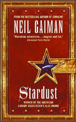


Stardust
This is another cover I find myself really liking. It's a neat concept, even if it isn't the most original. However, it isn't something you see all the time, and that in itself is intriguing. The colours and style give the sense of a leather journal. It may be a bit plain, yeah, but the "latch" shows something a bit fantastic, which I think sums up the book quite aptly.

These Hellish Happenings
It's not absolutely terrible, but it's not really something either. It basically looks like what it is: a cheap ebook cover. Not everyone has the funds to pay for a fantastic looking cover. For what it is, it's fairly cute, which reflects its contents so I believe it would obtain the right demographics of people. Personally, I could not see me being that attracted to it, but I wouldn't be saying, "No, no, no," either. However, I think it works well for the book.
All Together Dead
And we're back to the Sookie Stackhouse covers. Guess what? They're still horrible. Again, it's nice to see an actual scene on the cover, but the artwork is still horrible for these books. Even though I know what is going on, it looks like Eric and Sookie are about to go sledding with a coffin. I'm not sure what else to say that hasn't been said about these covers. Childish, cheesy, and all together awful.

From Dead to Worse
Well, there have been some changes to the covers. The title font is now a more generic font, and there is glitter. Well, I have to admit the glitter does get my attention, but I am still so put off by the artwork that I doubt I would have normally picked it up. I do like the red cloud background though. Its various shades are quite appealing to the eye. However, the characters ... um, what are they doing exactly? Seriously, why are they randomly floating around? Is this red cloud storm part of another dimension with a severe lack of gravity? Seriously, what is going on here?

Hit List
So the Anita Blake books has changed covers again. I have to say, it's better than the tool covers that were prior to this, but it's still bad. I'm not quite sure what they were going for here, but it looks haphazard and messy. I am assuming they were trying to mesh romance with Dan Brown. Yes, I was attracted to the cover, but then I wanted to just run away. I guess the good news is that this cover screams "CHEAP PORN!" so at least it promotes the material within well enough. Personally though, I cannot see the cover bringing in hordes of new fans.

Dead and Gone
Of all the Sookie covers (non True Blood ones), this one is probably my favourite. Personally, I probably wouldn't have picked it up based on cover alone, but the colours are really striking and contrast really well. Sookie also looks older than on some of the past covers so that creepy factor isn't there. The balance of the characters works well for the cover as well. Granted, the vampires still look incredibly cheesy and Sookie is floating in midair and seems to have lost her hands, but it could be much worse.


Dead in the Family
I'm really running out of things to say for these Sookie covers. There's nice colouration again and more eye catching glitter. The covers remain cartoonish and silly looking. The only thing I want to know is why is Sookie barefoot in most of these covers?
Dead Reckoning
I'm sure you're getting sick of reading about these Sookie covers so I'll keep it short. I like the colouration again, and the words are nicely placed, but again bad illustrations for the series. As to this particular cover, why is Sookie hanging upside down? Does the cover artist just like making her float in random places?

The Claiming of Sleeping Beauty
Personally, I really like the Sleeping Beauty covers. They clearly show that there is going to be erotica within, but the covers aren't trashy either. Honestly, they remind me of a Renaissance painting. However, the downfall to them is they can be quite the embarrassment to read in public (for most people anyway). I also am quite fond of the font used here, along with the bronzen banner. It adds to the elegance of the covers.
As to this singular cover, I find the fact the woman is sleeping and looking innocent quite delightful. It shows how Beauty starts out (though the writing within is far from innocent). Another nice touch is that within all these browns, there is a red book, bringing a touch of colour to it all, but there is also a touch of blue across from it to balance everything out. It's a gorgeous cover that ought to bring in those looking for the erotic. It's just not everyone will be willing to take it out in public.

Beauty's Punishment
As before, it's another beautiful cover with its colouring and style, and again, it's bound to bring blush to many cheeks if they step outside their front door with it, but I've mentioned all that in The Claiming of Sleeping Beauty.
Again, I am loving just the small bit of colour in the cover. It makes it soft but keeps it from being bland. I also like that the woman can still metaphorically represent Beauty. Her pose is more sexual in this one, showing that she is coming into her sexuality more. However, she isn't fully awakened yet therefore her eyes are still shut.
Beauty's Release
Ah. The final cover of this set, and just as beautiful as the rest. Again, we have mostly browns but with that spot of red in the background that brings it all together. Then, we have our metaphorical Beauty. This time she is fully awakened to her sexuality. The pose is flirtatious and the woman has a coy look upon her face. What's more is her eyes are now open. She is aware of who she is.
Personally, it is the metaphor carried through these three covers that bring what I find lovely covers to fantastic ones. Not only that, but these covers ought to bring in the people they are intended for the most part. Granted, these covers don't scream BDSM either so a few may be surprised by that based on the covers alone.
The Graveyard Book
It's not the most fascinating cover in the world, but it works. The only "solid" object is a tombstone with a fog swirling around it. It gives you the sense that this is a dark tale (which it is), but it doesn't give you the sense that this book is for the goths only. This cover is also quite unique, which makes it stand out on the shelf. What's more is that I cannot see this being an embarrassment to anyone. Even though it is written for youth, an adult can carry it without feeling the need to hide it. It's simple, yes, but it is a fantastic cover for this novel.
The Fallen 1
To sum this cover up in two words: marketing fail! Based on cover alone, it's not bad. The photo is nicely done, and where they chose to place the text works quite well. There is definitely a sense of balance. The book is even about angels so that part isn't misleading. However, when I first saw this, I thought tween romance. If any of you thought differently, tell me now. However, this is anything but. There is a little romance in there, yes, but this book is mostly adventure and action. I even mentioned in my review that the male gender would probably highly enjoy this, but how embarrassing would it be to hold that cover as a teenage boy? Not that I'm a teenage boy, but even I was embarrassed. This cover is bound to keep away most of the males out there yet the story is one many would probably enjoy. As I said before, marketing fail!


The Well of Loneliness
I find this to be an excellent cover. Personally, I am not overally fond of this art style, but it works. The shapes and colours all work together and draw you in. The brightness of the red, the vividness of the the green, along with the more neutral tones create a marvelous balance that is eye catching without being too harsh. However, I think what brings you in the most in the woman's eyes. They pull you in with an intensity like no other. Fabulous all around.
The Fallen 2
Like its previous counterpart, this cover isn't all together bad. The lighting is nice, and the contrast catches your eye. It's also nice to see that the only colour is the font. However, like the first Fallen, it is marketing toward the wrong demographic. Few teenage boys are going to pick that up.

The Fallen 3
Again, this is geared toward the wrong demographic, but it's still a good cover. It's just the wrong cover for this book. Like before, we have another shirtless pretty boy angel decked in high contrast black and white. The one thing I really like is when you get the three Fallen novels together, they make a pretty nice set. You have the first one with the boy looking to the right, the second one he is looking straight forward, and this one has him toward the left. However, as I said these books ought to be geared so that boys will pick them up as well, and they clearly are not. So with that in mind, I'd have to say these covers are duds.
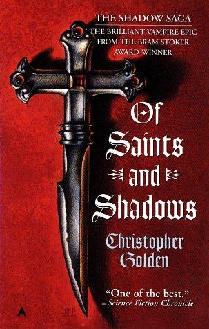
Of Saints and Shadows
Okay, seeing as how this is the original cover, I realise it is pretty dated. However, I still think some of the retro covers can be pretty awesome. I can't say this is one of them, but it's not horrible either. I don't think it'd get much of a glance nowadays, but back then, maybe. Cross like dagger on a shaded red background? Simple yet effective. Where they placed the title and quotes works rather well, giving it a nice sense of balance. Plus, I can see it bringing in the people who would probably be interested in such a book. Dated but effective.
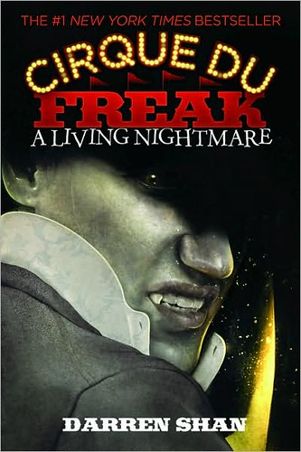
Cirque du Freak: A Living Nightmare
As a whole, I really like these covers. First off, all the covers are metallic, and not just part of the colours or a slight sheen. No, the covers are shiny all over, but strangely this isn't obnoxious. Not only is it eye catching, but it's bound to grab a younger crowd's attention. Then, there is the title. I mean, just look at it. It is awesome. It has nice, eye catching shape and colours and even manages to bring in some circus aspects like the tent flags and lights. Spectacular.
As for the individual cover, well, it's fantastic. The colours are balanced well, and even though the cover is metallic, you can tell this is going to be a darker book. I mean, there's a vampire (based in a dull silverish grey), looking over his shoulder and snarling at you, the reader. Add to the fact that his face is half in shadow, and you're easily aware that this book will not have butterflies and sunshine galore. This is an amazing cover that is bound to bring in the proper audience.
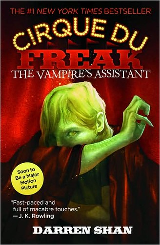
Cirque du Freak: The Vampire's Assistant
Like the previous cover, this one is just as brilliant. Again, you can tell this going to be a darker book with the blacks and red. However, the green of his skin manages to create a nice colour balance with the title. We also have another mysterious character. Whereas before, the vampire was in shadow, this freak is hiding half his face. I remember seeing this in the store and wondering who that was on the cover. Another excellent cover in the Cirque du Freak series.
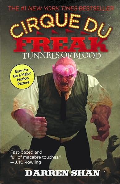
Cirque du Freak: Tunnels of Blood
Although I feel this isn't the strongest cover in the Cirque du Freak series, it still works fairly well. The brownish greys and bodies near the bottom show once more that this book will have some grit to it. The person on the cover looks mean and terrifying, which is bound to bring in horror fans. I have to admit I wondered why he was purple though. You do find out why in the books, but until I did, I thought it looked a bit silly. All in all, it's still a good cover though. Not so great on its own, but good.
Cirque du Freak: Vampire Mountain
Ahhhh! Zombie bear! Sorry, but this is always the first thought I have when seeing this. I guess it still has the scary aspect for the youth of the horror genre, and it's always nice to see scenes from the book come to life on the covers, but the bear is HUGE! I'd say the cover isn't horrible; it's just a bit over the top.
Cirque du Freak: Trials of Death
It's a freaking skull! How cool is that? This is one of the Cirque du Freak covers that could interest me even if I saw it alone. Some of the mystery is back with the smoke surrounding the skull. Then, you have this glowing light to help balance out all the colours. Plus, it's a freaking skull. Wicked. This is definitely one of the cooler Cirque du Freak covers and bound to help bring in those who would like the books. On a more snarky note though, Indiana called. They wanted their glowing diamond rocks back. Sorry, I couldn't resist.


 The Last Unicorn
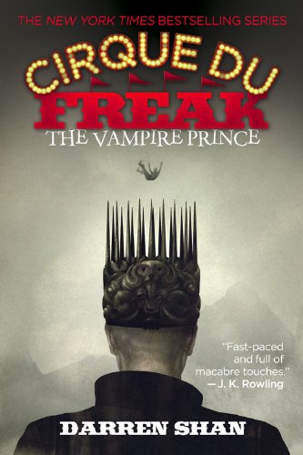
Cirque du Freak: The Vampire Prince
I was never ever able to pinpoint it exactly, but I adore this cover. Somehow, it manages to hold such weight. Perhaps it is the stillness and the stiffness of the prince as he is watching someone fall to his death, watching and obviously not caring. Even without seeing them, I can feel the coldness in his eyes. The crown he wears also helps give a sense of foreboding. You can see that it clearly has some weight to it, and the stiff and spiky design reminds me of a fortress or castle. It's beautiful and cold and one of my favourite covers.
Cirque du Freak: Hunters of the Dusk
I kept coming back to this cover, not really sure what I thought of it though I think part of it is I wasn't overly thrilled with the interior. As for the actual cover though, it's pretty neat. Is it one of my favourites? No. I wouldn't even say it's one of my favourite Cirque du Freak covers. However, as I've mentioned, it's still pretty cool. Again, we have a mysterious thing going on as his hair covers most of the face, and I have to admit to being curious as to what the liquid was that was coming out of his mouth. I mean, it's green. All in all, it's not the strongest cover, but it's certainly not a bad one by any means.
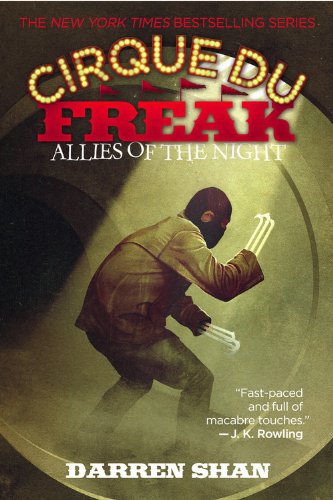
Cirque du Freak: Allies of the Night
Again, I can't say this is one of the strongest Cirque du Freak covers, but it still has its elements. Although it's not as shadowed as some of its prior counterparts, it still has a nice stream of light so there is some sense of light and shadows again. The character on the cover would probably do a pretty decent job at bringing in some of the male crowd as well, but overall, I found this particular cover fairly plan.
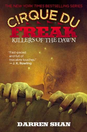
Cirque du Freak: Killers of the Dawn
It works with the set, but in all honestly, I disliked this cover. Do I hate it? No, but it fell flat to me. There just seems to be too much smoke and nothing to really catch the eye. It's a cover that you see and would probably pass by. It's not really bad, and it's not bound to bring in the wrong crowd. It's just there.
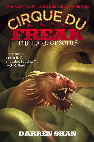
Cirque du Freak: The Lake of Souls
Personally, I think this is one of the cooler Cirque du Freak covers. It might not be the most alluring, but it is definitely cool. You are immediately drawn to what one assumes is a dragon head, and before you know it, your eyes are following the path of its body. Well, as much as you are able to. Then, when you add the title in, you could perhaps picture this creature gliding through this massive lake. Well, at least I did. It's also bound to get people wondering how this creature relates to the story and perhaps wonder what other monstrosities lie within the pages. It's a cover that works, and it's wicked cool.
Cirque du Freak: Lord of the Shadows
Like The Vampire Prince, this is easily one of my favourite covers. To put it simply, it's creepy. This is probably one of the darker looking Cirque du Freak covers, and it works. Upon looking at this, you know this guy is evil with his tattered clothes, discoloured skin, and that mouth that seems to be impossible to look away from. How could you not want to see how this guy fits into the story. This cover just sets the perfect amount of unease that ought to make people wanting to find out more.
Cirque du Freak: Sons of Destiny
Okay, I don't know about you, but I can hear a snickering laugh behind that smile as he watches his plan unfold. It may not be the strongest cover, but I think it still packs quite the punch. This is another cover that is bound to set off an emotion. For me, he looks like that scientist that wants to see how his experiment turns out, rather for good or ill. Not sure how to describe that as an emotion, but it stirs something, and like the cover, I'd be interested to see how it played out. An excellent work.

The Scarlet Pimpernel (Cover #1)
Before buying the book, I got it from the library so since I actually held this cover in my hands as well, it will also be reviewed.
Dear gods, what a boring cover. It looks like the emblem for some top notch university that was drawn on notebook paper. Seriously, I have seen more interesting textbook covers. I cannot see anyone seeing this cover and thinking, "Oh, that looks interesting," not even those who adore classic literature. I understand this is an outdated cover, but I don't see how this cover ever could have worked well.
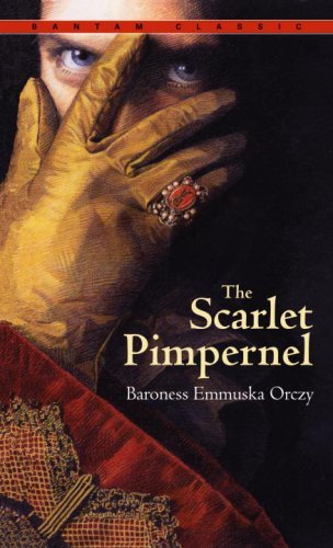
The Scarlet Pimpernel (Cover #2)
Okay, I am in love with this cover. Seriously, I went out of my way to make sure I had this cover when I purchased this novel. Now, where to begin? First off, I love the fact that it looks like a drawing or painting. I really think that helps give it a certain feel, something older and more elegant. I also like the colours they chose for the drawing: all different shades of the primary colours, creating a lovely sense of balance. However, I think what I love most about this is everything leading up to the eyes and how those eyes draw you in. To me, they seem to be telling a story, but the eyes can only tell so much. It is those eyes that make me want to reach out and delve into the pages.
The only thing that could have made this cover better is getting a different font for the title. It just seems a little too plain. Even with that though, this is easily one of my favourite covers, and I hope others can see why. It's gorgeous and striking and holds a great sense of mystery to it. Personally, I feel that it is the perfect cover for The Scarlet Pimpernel.
Another beautiful cover. This is another cover where everything in it seems to work. The actual picture is beautiful and is bound to bring in the fantasy lovers. Although I feel this is a book both men and women can enjoy, both the cover and the title are bound to bring in more of the female fantasy lovers. The font chosen is simple but works well against such a fantastic background, and the quote and title are aptly placed so that they do not detract from the visual. Overall, it is a marvelous piece and is bound to bring in those that will enjoy it.


Necroscope
It's simple, but it works. There is no doubt upon looking at this cover that this is a horror novel. You have the dark colours, a wicked, pointed tongue, sharp canines, and a skull. Heck, even without reading the back, you'd probably be aware that it's a vampire book even. Then, the unique font makes it where the cover isn't too plain so that it may get overlooked. As I said, it's simple, but it works. There's a reason this cover has been used for over twenty years.
The Red Pyramid
From the author of the Percy Jackson series, we have The Kane Chronicles. First off, it only makes sense to have a similar cover style to the Percy Jackson books since it is bound to bring in those fans as well. Even without seeing the author's name, you are bound to think it is similar to Percy Jackson.
As to the cover in itself, it's pretty cool. Personally, it catches my attention every time on the bookshelf. It is also fairly gender neutral, allowing both boys and girls to read it with little chance of being made fun of. You can also tell that this is a book that is bound to be full of adventure. It's a little busy, but it still makes an excellent cover, I think.
Blue Bloods
As a series, I like the Blue Bloods covers, but when it comes to the Blue Bloods novel ... not so much. Now, there are things I like and think work well, but two of those carry over to the other series covers as well. First off, I think that title works really well. It has both a simplicity and an elegance to it, much like the blue bloods themselves. The other thing I like is the cityscape silhouette at the bottom. Each cityscape is different for each book, showing the city that plays a major role in said book. For example, this city is New York City, where it all starts and it is all based. The last thing I liked about this cover pertained to this cover alone, which would be the pearls. Like the title, it brings the elite into the cover by bringing in both simplicity and elegance.
What I disliked about this cover was the photo chosen. The concept is great and likely to bring in the young girls that this would appeal to, but the actual photograph is washed out and has no depth to it. It's even fuzzy as well. I'm guessing they were trying to go for a soft feel, but it's just blurry and not pleasing to the eyes.

Masquerade
This is one of the Blue Bloods covers that I like. It might not be the best one of the series, but it still works. I think the fading near the bottom of the mask looks a bit odd, and makes the face seem a bit round, but other than that, it's pretty fantastic. The mask is elegant, like the blue blood society. What's more is it definitely has a Venetian feel to it, which is the city chosen for this book cover. However, I think my favourite part of this cover is how you are drawn to the eyes, which happens to have the only colour. The eyes hold a piercing gaze, which I believe helps draw the reader toward the cover even more. Now, this cover does have a feel of the teen romance, or at least, more girl oriented, which again, works since the female gender is probably more likely to enjoy this book than the men.
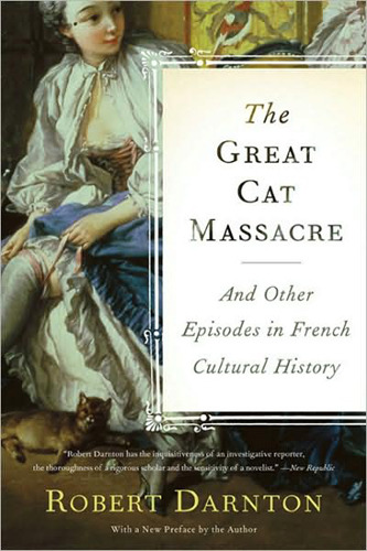 The Great Cat Massacre
 The Hunger Games
I am sure you are getting tired of hearing this by now, but this is another fantastic cover. First off, this cover would do an excellent job at bringing in those that may be interested. I mean, a painting of an 18th century style woman is bound to bring in those interested in the 18th century. The title plaque also works well with the cover. It is something very simple on background that has quite a few details to it, making it where your eyes aren't looking everywhere and making it where they do focus on the title.
I also have to admit I am in love with the picture they used. I love the style, the colours, and lines, and it's even a bit scandalous (you can see most of her leg! *le gasp*). Overall, this is an excellent cover for this book with its great choice of picture and a well put together layout.

Okay, as much as I disliked the book, I actually like the cover. It's very simple, but it works. The monochromatic helps gives it a simple and classy feel. The lettering placement is well balanced. The photograph itself leads the eye well so again, you don't feel that you don't know where to look. However, I think what I like most about this is that the tie makes quite the impact in the book. Yes, there are some brilliant covers out there that have little or nothing to do with the book, but it is always great to see a cover that relates to the book somehow.
I also have to admit I am in love with the picture they used. I love the style, the colours, and lines, and it's even a bit scandalous (you can see most of her leg! *le gasp*). Overall, this is an excellent cover for this book with its great choice of picture and a well put together layout.
Fifty Shades of Grey
I believe the best thing The Hunger Games covers have going for them is that they are different, meaning they stand out on the shelf. We have another fairly simple cover, but again, it works wonders. The simple lines guide your eye to the symbol that lasts through the books: the mockingjay. I also like the font chosen for the cover. It's heavy and large, much like what is in between the book's pages. From looking at this cover, you may not know what to expect, but I doubt you'd guess something light and pretty.

Catching Fire
What else can I really say about this one that I haven't said about The Hunger Games cover? The design is practically the same with some alterations. I do like the gradient of yellow to red, giving that sense of fire without it being so obvious that they decided to actually put flames on the cover. Like its prior counterpart, it's simple, and it works.


Revelations
This is another one of the Blue Bloods covers that I felt wasn't all too great. Yes, it is nice to see things relating to the interior of the book, but like the first Blue Bloods cover, the picture chosen is blurry, making everything a bit off-putting. It's not a horrible cover by any means but neither is it fantastic. Sometimes a soft, blurry edged feel works wonders, but this is not one of them.
Mockingjay
This is probably my least favourite cover of the trilogy. It just seems too bright, and the circles aren't even and orderly any longer. Granted, that could symbolise the Capital losing its hold on the districts. Although I like the symbolism, I still find it less pleasing to look at.
However, my favourite bit about these covers is the mockingjay and what it stands for. In The Hunger Games, we are shown the mockingjay pin. It's stuck in that pose, hard and unable to move, much like the districts. However, the mockingjay in Catching Fire has escaped its golden shell, and is starting to reach out its wings and take fight, but the ring still holds it in check. Finally, in Mockingjay, the mockingjay is able to be free. Nothing is holding it back. It is the mockingjay throughout these covers that I love, because I feel it is a fantastic metaphor for what happens in the actual books.

Beauty
So there may not be tits or nudity, but every time I look at this cover, all I can think of is porn (and not just because it's Anita Blake). Now, there isn't anything wrong with porn, but personally, I get the sense of cheap and trashy from this cover. Granted, I am glad that this cover screams porn, because at least, it's being honest. Do I find it sexy? No, but I think it is likely to bring in those looking for smut so I guess it works.
The Van Alen Legacy
And we're back to the Blue Bloods covers. Honestly, I find this cover to be quite pleasing to the eye. Although it's not a favourite, it has a nice line of sight and colouration. It also has a sense of being ethereal and elegant, which I think works well for these books. Whats more is it still marketed toward the demographic that would mostly likely enjoy these books. Another excellent cover for the Blue Bloods series.
Blue Bloods: Keys to the Repository
This is probably my favourite cover of the Blue Bloods books. Like Masquerade, the artwork relates to the title, but what I love most about it is that it draws you in. You get a sense of mystery and that someone is trying to peek into a new and fascinating world. This was actually the cover I saw that got me interested in the Blue Bloods series and wondering what it was about.

Misguided Angel
Sure the Blue Bloods covers tend to be a bit fem, but I'll say it again, they work. Misguided Angel is no exception. The softness and style are geared toward the right demographic once again. You also have a nice line of sight from the angel wings. The only thing I really dislike about this cover is the wings are a bit blinding.
Bloody Valentine
Finally, the last cover for this post. I'm not sure what else to say that hasn't really been said for these covers. I really like where they cropped the photo, and I'm happy to see a flower that isn't a rose for a romance/vampire book. Don't get me wrong. I love roses, but they tend to be overused. All in all, it's quite the nice cover, and it's bound to bring in new fans who would be interested in this type of series.
No comments:
Post a Comment